Monday, 26 April 2010
Evaluation - Amber Rawlings, 3168
Evaluation
Above is my evaluation, however due to having to upload it to blogger it has lost the music that was embedded into the slides which was music from our teaser trailer.
Sunday, 25 April 2010
Tuesday, 20 April 2010
iDVD
Within these themes you could add in submenus, many links, pictures and footage from the films. We have tried and tested out DVD menu to ensure that all of the links work and that it was easy for the audience to navigate around.
However when using this programme we encountered the problem of not being able to change the colour schemes of the layouts which meant that although we found a layout that we felt best suited our film genre, the colour scheme was not correct and we therefore had to compromise between the two to make sure that our DVD menu was kept cohesive with the rest of our texts.
Overall we believe that this programme made out DVD more realistic and looked very professional once completed, tried and tested.
Monday, 19 April 2010
DVD Write Up
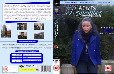
In our previous research of DVD covers we discovered many conventions; here are the conventions that we included: synopsis, pictures, production company website, credits, running time, language, main feature subtitles, company logo, classification, barcode, reviews from magazines, layout, main cast, titles, strap line and a big picture as the background image. We decided to use all of these conventions on our own DVD cover to make it look as professional and realistic as possible.
Magazine Front Cover
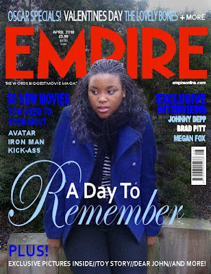 Firstly, we used the same image that we have used through out our ancillary tasks as this would enable the image to be recognisable to the public and they would be able to link it to the film. It has maintained cohesive along with the colour scheme of dark blue, light blue and white, which we also used as the colour scheme for our magazine. This was ideal as when researching existing 'Empire' magazine front covers, we noticed that normally the colour schoeme featured on average three different colours, so therefore we also did this. We also used the same text in our magazine front cover as the rest of our ancillary tasks to again keep it cohesive and recognisable text.
We included the conventional featured of an 'Empire' magazine front cover, such as we noticed that every empire magazine cover featured the date and prices above the letter 'M'. We also used the strap line on the left hand side under the title and on the right hand side put the magazine website address. Our image that we used over lapped part of the title and this commonly occurs in existing 'Empire' magazine front covers as it suggests that the magazine is well branded. Having the character in front also makes the image stand out. We included a bar code on our magazine front cover and put it on side ways as in most editions of 'Empire' magazines this is done.
The cover line on our magazine was the title of our film as this is the main article featured in the magazine. We had it central and the biggest piece of text on the cover to inform the audience that it is the main feature in the magazine and to make it stand out. We used teasers to attract the audience and make them excited about the content of the magazine therefore making them want to purchase, for example 'Exclusive Interviews' and 'Plus More'.
Sunday, 11 April 2010
Film Poster
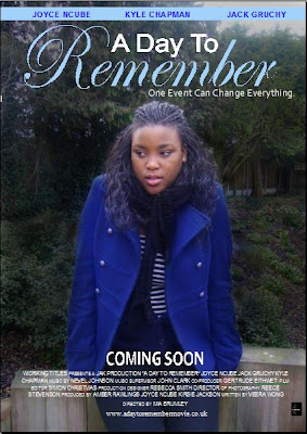 Firstly, we chose this image for our poster as we felt that it was effective in catching people’s attention, as it was successful in portraying the characters emotions. The theme of blue, such as the blue coat the character is wearing is also effecting in showing the sadness of the character. The use of mid shot is effective as it enables the viewers to get a clear look at the character, as well as the surroundings. It enables them to see the emotion of the character and relate to her. It is also conventional to most other film posters which we found in our earlier research, the film posters commonly include mid shots or long shots.
We maintained the theme of blue throughout, such as in the film titles and character names to make it cohesive and set a theme. We kept the same font ,font colours and positioning of the text as the DVD cover to make it cohesive and recognisable to the public.
From our research on existing film posters, we took in to account the conventions needed for a film poster. We found that in most cases these varied for example some film posters included more information than others such as the film website address. The conventions that we included were: ‘Coming Soon’, the production company logo, the film website address, the cast names and other credits. We also tried to order them in the most conventional way.
The use of mid shot is effective as it enables the viewers to get a clear look at the character, as well as the surroundings. It enables them to see the emotion of the character and relate to her. It is also conventional to most other film posters.
Editing Photos
‘Adobe PhotoShop CS4’ was very useful in changing the brightness and colour of the photos. For example for our main photo we adjusted the background colour to make the main character stand out in the foreground. As well as this we used a blue colouring on the main characters jacket to make it stand out more as the theme of our film as blue signifies sadness. This was very easy to do on PhotoShop. However when using PhotoShop we had the problem of only being able to click undo once which meant that we then had to start from the beginning as the tool that let you put a certain section back to its original form sometimes did not work.
As most of the members of our group our familiar with ‘Jasc Paint Shop Pro 9’ it was very easy to edit the photos in. we mainly used this software to blend photos together for our film website and to blend the images into the background of out film website. We felt that by doing this it looked a lot neater and a lot less block. Other features that we used on this software was the background eraser tool which made it very easy to erase the background of photos and logos for example we were able to copy the ‘Empire’ Logo of an existing magazine and cut out its background using the background eraser tool with great ease, this made it a lot easier to make our DVD cover, poster and magazine front cover.
In both programmes it was easy to take sections from the photos that we most liked by using the crop tool and the selection tool. We felt that by using both of these programmes we could capture the effect that we wanted making certain signifiers stand out to the audience.
Strap Line
Lifes journey
A memory that will last forever
Can happiness be regained?
When the unexpected occurs
One event can change everything
After much discussion and gaining the opinion of a range of people we decided that the strap line best suited for our film was ‘One event can change everything’. We felt that this was most suitable as it is an additional summary to our film and highlights a main theme in our film. The strap line flowed well with the title of our trailer and was effective in making the audience think into depth about the statement.
Intertextual

We used a similar shot to this from ‘500 Days of Summer’ as we thought that having the characters facing away from the camera created an ambiguous feel and the use of establishing wide shot had a great focus on the scenery. We felt that it fitted the romantic drama genre well because the bench was a romantic prop and it signifies romantic social interaction. The use of a two shot also added impact to this.
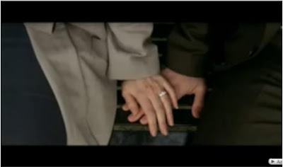 We used this close up shot, as again we felt that it was ambiguous and created a bit of mystery. Therefore the audience will want to know more. It also it effective in showing a romantic gesture and signifies closeness between the two characters.
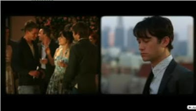 We chose to use a split screen similar to this as we thought the way it created juxtaposition between happiness and sadness was effective. We also thought it would be effective in showing the actions of two people in different places but at the same time.
 We like the use of trees for framing so therefore came up with a similar idea using leaves as framing to create a more interesting and individual shot.
The Time Travellers Wife

We used a shot similar to this because we felt like it was commonly featured in Romantic film genres and the establishing wide shot enables romantic scenery to be included in the shot.
Our plot line can be associated with ‘Save the Last Dance’ as like this films plot the character has to move away to a location which is very unfamiliar to what she is used to. Like this film the character also struggles to fit in and adapt to her new surroundings. However we have adapted the idea and made it our own by having many factors of the storyline differing. We have used different types of mise en scene, characters and other ideas. We have also eliminated one of the main themes (Dancing).
Film Website
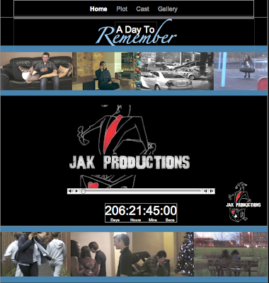
There were many templates on Iweb that we considered and tested those that we believed to be most suitable of our genre and teaser trailer, we then narrowed it down to a layout that we most liked and put together ideas for the arrangement of the website.
Due to the ease of the programme we were able to experiment with different designs and then finally pick one. In this the colours we chose were black, white and blue. These colours were cohesive to the rest of our ancillary tasks and had certain connotations for example the theme of blue runs throughout our work as we have used it to signify the sadness of our character.
We used still images from our teaser trailer to give the viewer an insight to our film hoping that this will impact on them gaining interest in the film, this was also a feature in the website for ‘500 Days of Summer’. As our pictures were in a chronological order it immediately gives the audience an insight to the plot line and enables them to gain interest. We also used the images as framing and sectioning of our website. We felt that the different sections made the website look neater and gave it a clear structure. We included our teaser trailer in our film website as from our research of existing film websites we found that the trailer was featured in everyone website we looked at.
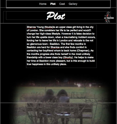
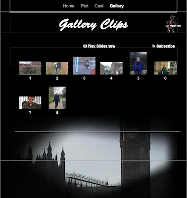
We have included fully working links, which are set out in a structured way, along the top of the website. We have linked every page to each other, making it easy for viewers to navigate around our website easily. These links are: Home page, Cast, Synopsis and Gallery. We chose these pages as from taking our research into consideration; similar pages were featured on existing websites.
Here is a link to our website: http://www.beaumedia.org.uk/A_Day_To_Remember/A_Day_To_Remember/Home.html
Below are printscreens of our four pages on the website that we have created for our film:

Music
We began by looking at many websites on the internet for example http://www.unsignedbandweb.com/ and http://mobygratis.com/film-music.html however after looking through both these websites and many more we came to the problem of now finding anything that we believed would be suitable for our production. As well as this a man names Stephen Scott had kindly given our media class some copy right free music that he had made however again when listening to all of the tracks we still felt that none of the pieces were what we were looking for.
Luckily half way through the course we were given Mac's and therefore due to the music problems we were having started to try out garage band by putting beats and instruments together and layering the music. We also started to adjust the speed and the pitch to try and get some pieces of music that we believed would be suitable. After using a trial and error method and many attempts we finally managed to create two pieces of music that we felt fitted our teaser trailer and was what we were looking for as we believed that it gave the right impressions and helped show of our themes and express both equilibrium and disequilibrium in the correct places.
Saturday, 10 April 2010
Facebook Page
Once we had created the page we added information about the film including; the title, the plot, who it is starring, the production company, the fact that it is coming soon, the directors and the producers. As well as this we uploaded photos from the film and from the photo shoot, once we had uploaded this album we also then created another in which we uploaded the ancillary promotional texts. We did this as we beleived that it would create hype and Facebook is a quick way to spread the word of mouth about your film.
Once the page was completed we promoted it through our own page by sending the link to people on Facebook chat, in messages, by updating our status and by writing on peoples walls. We found this to be a huge success with over 90 people adding the page within the first day and this therefore shows the scale of how quickly things can spread on Facebook and by using viral marketing.
When we had many fans we then hyped up the film and added the rough cut of our teaser trailer in which we then used this page to get audience feedback which we then acted upon and once completed, uploaded the final cut of the teaser trailer.
We found this page particularly useful as it meant that we could ask a large range and variety of people for feedback and opinion on our film as well as the feedback that we received from our class. We also felt that this was a good way to spread the world of mouth about our film.
The Link to our Facebook page - http://www.facebook.com/home.php?#!/pages/A-Day-To-Remember-Film/100184023
Editing Software
Firstly, we uploaded our footage from adobe to the Macs, in one full piece, however when trying to edit we experienced some difficulty because this meant that we had to split the sections we wanted in the correct place and it was taking to much time. As a result of this we went back to adobe and uploaded the footage into separate sections. We found this much easier and less time consuming.
Secondly, we added in transitions and edited colour, contrast and brightness to some shots, to create certain effects that we were aiming for. We then split shots, to enable us to add in transitions between shots, to make shots shorter and snappy. For example we thought that the shot in the ally way was too long so added in a few fade to black transitions to make it more conventional to a teaser trailer. We also changed the speed of some shots to emphasis certain themes in our plot. We added in a wide range of sound effects that we felt would add impact to our trailer. Such as: telephone ring, footsteps, dog barking and heart beat. We changed the length of the sound effects to fit the length of the shots. We also adjusted the sound levels, as some were supposed to be ambient and others more deliberate and noticeable.
From Garage Band, we added music into our trailer. We cut the music to fit certain shots. We also cut it where we wanted the music to drop on a specific scene. We adjusted the volume of the music to the level we thought was appropriate and added fades in various places.
We used the font panel to add in: titles, ‘Coming Soon’, the film website address and the classification preview screen. We used different fonts, colours, background colours and font transitions.
Audience Feedback
They also gave us feedback on what we could do to improve. They thought that adding titles would be a good idea in showing a clearer narrative. Therefore we added in three separate titles, which we felt would make it easier for an audience to understand the narrative with more ease, without giving too much of the plot line away. They also felt that I would be better to elongate the heartbeat sound effect over the ‘coming soon’ titles. We did this and felt that it made it more cohesive. Because we were using Apple Macs, our audience advised us to experiment more with the fonts and font transitions to make it look more professional. Therefore we spent more time trying out different fonts and font transitions to get a more suitable style for our genre and for a teaser trailer. From our feedback, the audience thought that we needed to add in institutional information to make it look as realistic and professional as possible. We did this and found that it met the expectations.
Thursday, 8 April 2010
Rough Cut Teaser Trailer
Above is the rough cut of our teaser trailer. We are now going to get audience feedback so as to make the trailer as professional as possible.