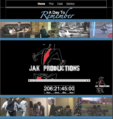
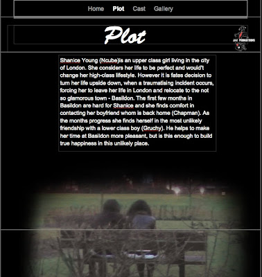
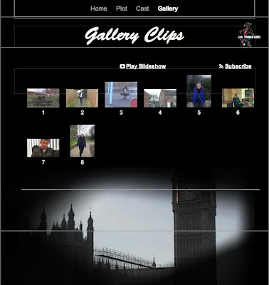
There were many templates on Iweb that we considered and tested those that we believed to be most suitable of our genre and teaser trailer, we then narrowed it down to a layout that we most liked and put together ideas for the arrangement of the website.
Due to the ease of the programme we were able to experiment with different designs and then finally pick one. In this the colours we chose were black, white and blue. These colours were cohesive to the rest of our ancillary tasks and had certain connotations for example the theme of blue runs throughout our work as we have used it to signify the sadness of our character.
We used still images from our teaser trailer to give the viewer an insight to our film hoping that this will impact on them gaining interest in the film, this was also a feature in the website for ‘500 Days of Summer’. As our pictures were in a chronological order it immediately gives the audience an insight to the plot line and enables them to gain interest. We also used the images as framing and sectioning of our website. We felt that the different sections made the website look neater and gave it a clear structure. We included our teaser trailer in our film website as from our research of existing film websites we found that the trailer was featured in everyone website we looked at.
We have included fully working links, which are set out in a structured way, along the top of the website. We have linked every page to each other, making it easy for viewers to navigate around our website easily. These links are: Home page, Cast, Synopsis and Gallery. We chose these pages as from taking our research into consideration; similar pages were featured on existing websites.
Here is a link to our website: http://www.beaumedia.org.uk/A_Day_To_Remember/A_Day_To_Remember/Home.html
Below are printscreens of our four pages on the website that we have created for our film:


Great planning, look forward to seeing the link.
ReplyDelete