Wednesday, 31 March 2010

Logo Analysis

Many films, television series, etc contain production company logos' either at the beginning of viewing or at the end. Production company logo's have become iconic over the years. The logo/sign is important as it gives the company enough credibility and publicity for future productions. The most noticeable one is probably the Warner Bros symbol.


Logo Idea's
We decidied to go with the idea of 'Jack in the Box' seeing as in our initials combined is JAK, hence JAK Productions. This is what we played around with;


Found this to be too plain, we had to add some colour and graffics to give it some character..


We decided to add the colour and put in a few scribbles, jus as a draft, to see what colour would do to the image.

This is our two final choices(below)


THIS WAS OUR WINNER!

Magazine Coverage

When production companies promote films they try and use all media mediams such as television, internet, magazines, newspapers, etc. The difference with magazine spreads is that the actor or actress is what initially appeals to readers, because majority of spreads have interview sections inside the actual magazine. This appeals to people because they may want to know more about the characters they play in the fil or just about the actor/actress' personal life in general. Some audiences buy magazines as a souvenir for keepsake reasons if they are a big fan of the movie. For example comic book lovers, may buy a magazine with a spread about the 'Batman' series, The Dark Knight.


The most popular British magazine that does these sort of spreads is 'Empire'. This magazine covers some of the biggest upcoming films of the year, and has been recognized for this as it is the the best-selling film magazine.


This is the sort of approach we want to take when creating our magazine cover, we want to use an image that immediately gives away our genre and the target audience we are aiming to reach. Our plan is to probably use an intimate picture between the main characters, that way it immediately catches our female audiences and the 'chic flick' lovers. Having said that the British film industry isn't really known for producing many bankable 'chic flicks' so we are going to have to use a very powerful shot to really catch audiences attention. We will be using the Empire format, because we are most inspired by it.




Teaser Trailer Classification

Through our research we found that majority of all teaser trailers we analysed were suitable for all audiences. So we decided we were going to follow that so that our teaser trailer could be shown in all cinemas that had different age certifications. Given our genre and our storyline our footage did not have any explicit language or images such as violence, sex etc. Our target audience were teenagers and female adults, our trailer would be classed in modern society as a ‘chic flick’ because it is an emotional romantic drama that most women could relate to, when it comes to love and trying to move on in ones life. Having said that, if our trailer was to become a film, we would probably get it certified to a ‘12’. Under The British Board of Film Classification, a rated ‘12’ movie is ‘no one under the age of 12 may view this film and an adult may take a younger child if, in their judgement, the film is suitable for that particular child.’ We think this is appropriate, as some bits in the storyline may affect younger children, such as the mother dying in a tragic accident.


Monday, 29 March 2010

Photo Shoot

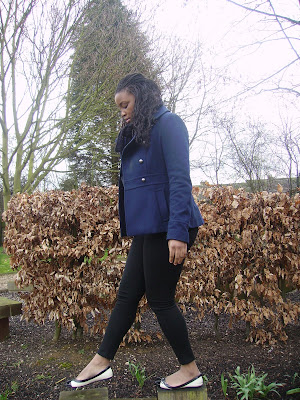
After looking into the ancillary tasks that our group were going to be going we noticed that we did not have any photos that were of good enough quality to use in our products, we therefore decided to have photo shoot of our main character. Below are some of our favourite images form the shoot:


We decided to put our main character in a blue coat to carry on the theme of blue as this colour signifies sadness. in all of these shots she is alone to denote the loneliness in her new life and how she is finding it difficult to fint in, this therefore helps the audience to relate to her. We chose the mise-en-scene that we had a wide choice of photos to choose from in the selection process, for example in the last picture we have carefully placed our main character in a setting with dead trees and bushes to signify how she has lost everything in her life and it emphasises her sadness.
In the selection process we decided to choose the top picture as we felt that it captured the sadness in her face and posture. As well as this we felt that the fact that it was a mid-shot was conventional of a film poster and magazine front cover, which we realised, in previous research of promotional campaigns of films of our genre. We also felt that it enabled the viewer to get a clear look at the characters emotion as well as her posture and lonely surroundings. After deciding on this picture we are going to edit the photos enhance the colour and keep up the significant themes.

Tuesday, 16 March 2010

Film Title

We decided to call our film 'A Day To Remember', as we felt that it implies the occurrence of a key event. The title is a big signifier to the idea of the film, as it implies to the audience that there is going to be a shocking incident and this title will attract them to the film. It also fits the romantic drama genre well as it seems like a suitable title for this genre.