Wednesday, 31 March 2010

Logo Analysis

Many films, television series, etc contain production company logos' either at the beginning of viewing or at the end. Production company logo's have become iconic over the years. The logo/sign is important as it gives the company enough credibility and publicity for future productions. The most noticeable one is probably the Warner Bros symbol.


Logo Idea's
We decidied to go with the idea of 'Jack in the Box' seeing as in our initials combined is JAK, hence JAK Productions. This is what we played around with;


Found this to be too plain, we had to add some colour and graffics to give it some character..


We decided to add the colour and put in a few scribbles, jus as a draft, to see what colour would do to the image.

This is our two final choices(below)


THIS WAS OUR WINNER!

Magazine Coverage

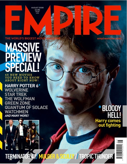
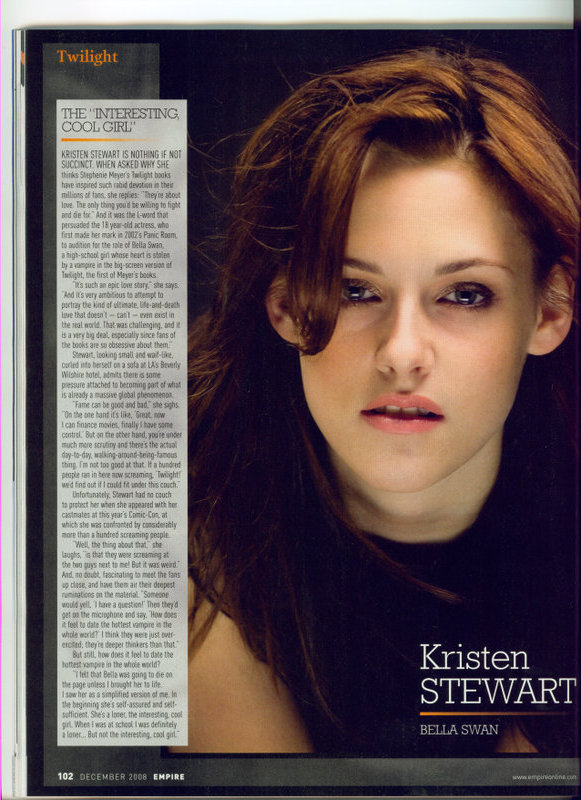
When production companies promote films they try and use all media mediams such as television, internet, magazines, newspapers, etc. The difference with magazine spreads is that the actor or actress is what initially appeals to readers, because majority of spreads have interview sections inside the actual magazine. This appeals to people because they may want to know more about the characters they play in the fil or just about the actor/actress' personal life in general. Some audiences buy magazines as a souvenir for keepsake reasons if they are a big fan of the movie. For example comic book lovers, may buy a magazine with a spread about the 'Batman' series, The Dark Knight.


The most popular British magazine that does these sort of spreads is 'Empire'. This magazine covers some of the biggest upcoming films of the year, and has been recognized for this as it is the the best-selling film magazine.


This is the sort of approach we want to take when creating our magazine cover, we want to use an image that immediately gives away our genre and the target audience we are aiming to reach. Our plan is to probably use an intimate picture between the main characters, that way it immediately catches our female audiences and the 'chic flick' lovers. Having said that the British film industry isn't really known for producing many bankable 'chic flicks' so we are going to have to use a very powerful shot to really catch audiences attention. We will be using the Empire format, because we are most inspired by it.


Teaser Trailer Classification

Through our research we found that majority of all teaser trailers we analysed were suitable for all audiences. So we decided we were going to follow that so that our teaser trailer could be shown in all cinemas that had different age certifications. Given our genre and our storyline our footage did not have any explicit language or images such as violence, sex etc. Our target audience were teenagers and female adults, our trailer would be classed in modern society as a ‘chic flick’ because it is an emotional romantic drama that most women could relate to, when it comes to love and trying to move on in ones life. Having said that, if our trailer was to become a film, we would probably get it certified to a ‘12’. Under The British Board of Film Classification, a rated ‘12’ movie is ‘no one under the age of 12 may view this film and an adult may take a younger child if, in their judgement, the film is suitable for that particular child.’ We think this is appropriate, as some bits in the storyline may affect younger children, such as the mother dying in a tragic accident.


Monday, 29 March 2010

Photo Shoot

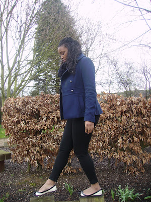
After looking into the ancillary tasks that our group were going to be going we noticed that we did not have any photos that were of good enough quality to use in our products, we therefore decided to have photo shoot of our main character. Below are some of our favourite images form the shoot:


We decided to put our main character in a blue coat to carry on the theme of blue as this colour signifies sadness. in all of these shots she is alone to denote the loneliness in her new life and how she is finding it difficult to fint in, this therefore helps the audience to relate to her. We chose the mise-en-scene that we had a wide choice of photos to choose from in the selection process, for example in the last picture we have carefully placed our main character in a setting with dead trees and bushes to signify how she has lost everything in her life and it emphasises her sadness.
In the selection process we decided to choose the top picture as we felt that it captured the sadness in her face and posture. As well as this we felt that the fact that it was a mid-shot was conventional of a film poster and magazine front cover, which we realised, in previous research of promotional campaigns of films of our genre. We also felt that it enabled the viewer to get a clear look at the characters emotion as well as her posture and lonely surroundings. After deciding on this picture we are going to edit the photos enhance the colour and keep up the significant themes.

Tuesday, 16 March 2010

Film Title

We decided to call our film 'A Day To Remember', as we felt that it implies the occurrence of a key event. The title is a big signifier to the idea of the film, as it implies to the audience that there is going to be a shocking incident and this title will attract them to the film. It also fits the romantic drama genre well as it seems like a suitable title for this genre.

Wednesday, 24 February 2010

Casting Decisions

We made our casting decisions carefully making sure we chose cast members as suitable as possible for their roles. To make it as believable as possible we chose to cast our main characters sister to play the mother, so they looked related and they had a natural family bond. We chose cast members who had similar styles to the character they would play so that their characters were more convincing and apparent to the audience, for example similar ways of dress and haircuts etc. We chose to cast an actually hotel receptionist to play that part as his role came naturally to him making it very convincing.

Saturday, 16 January 2010

DVD Cover Research

Before creating our own DVD cover, we firstly began to research existing DVD covers of a similar genre. These are the main DVD covers that we researched:

50 First Dates
500 Days of Summer
The Break Up
Forgetting Sarah Marshall
Me, Myself and Irene

When looking at these DVD covers we noticed all of the conventions that were required to make a DVD cover. The conventions that we felt that we needed to include on our DVD cover were synopsis, pictures, production company website, credits, running time, language, main feature subtitles, company logo, classification, barcode, reviews from magazines, layout, main cast, titles, strap line and a big picture as the background image.

Most of the DVD Covers that we looked at had the same layout, for example the main characters name along the top, a big picture as the background, a three colour scheme and the classification on the front, side and back.


Thursday, 14 January 2010

Viral Marketing

Viral marketing is a form of internet advertisement that is said to be word of mouth, it is any form of internet marketing specificaly social networks that is sent or put on one website and then the message spreads by word of mouth. This is a growing form of promotion as the amount of Internet users is rapidly growing. As well as this there are now many social networking websites around for example Facebook, Twitter, MySpace, YouTube and MSN. As well as companies and products being advertised on these sites films are hyped up and advertised on them. Many films create pages for their characters or make websites for there films and upload their trailers and T.V spots to YouTube.

A good example of how a film has used viral marketing is Cloverfield who first distributed a teaser trailer with no film name, just a website. When you logged onto this website which was the date of the film release (http://www.1-18-08.com/) it just had a pile of pictures with dates on them that you could move around to look at better (An image of this is below). Some of these pictures were clear pictures of friends and a party whilst others were very mysterious with effects on top of them making it very unclear of what they are of. This created even more of a hype and got people excited and talking about it on social networking website.

Cloverfield also used Facebook and MySpace to create pages for the characters of the film. This created even more hype for the film; there were links to these pages on the website. This made the film very up to date and accessible.


Wednesday, 13 January 2010

The representation on different people/groups

In our film we have represented two main areas. One being an upper class area and the other being a working class area. This has been represented highly through mise-en-scene. The shots, which are in the upper class area, are mainly of famous landmarks and expensive shops ect. The use of costumes makes it clear that one character is wealthier and from a richer background, whilst the other characters costume shows that he is from a poorer area.

Characters

There are many ways in which theorists have explained characters structure the first one being created by a Russian theorist Tzvetan Todorov
Vladimir Propp came up with the theory that there are only a certain amount of characters that can come up:

  • One of the character types that is used in our film is the hero this is the character that has the lead narrative and is trying to solve something, on a journey or on a quest, in our film this describes the main female character as she is on a journey to figure out her life after her mum dies. As our hero is a female this challenges the usual conventions as a film typically has a male lead role.
  • The dispatcher is a character that sends the hero off, although the mother isn’t shown in the trailer much she is the dispatcher of the film, as she dies leaving the girl alone and having to go on her journey.

Posh Girl
In our film the main character is a female that is of upper class, she is very naïve and in her own upper class world, she is not very aware of the bad things in life until her mum dies. Her personality however she is then forced to change when she is moved to live in an average town, she then starts to realise what life is about.

Being the ‘Hero’ in the film she follows Tzvetan Todorov theory as the start of the trailer shows Equilibrium where everything is good and happy, there is then a disruption in her life, when her mum dies, this is the Disequilibrium a resolution then starts to occur towards the end of the teaser trailer however there is then another disequilibrium and you will need to watch the film to find out how it is resolved.

Upper Class Boy (William)
In our film William; the upper class boy, is very pompous and has a sense of self-importance. Compared to the lower class boy he is dull and plain. He believes that he is in love with the posh girl and thinks that she loves him back just as much, however will the bubbly personality of the lower class boy change things?

Lower Class Boy
In our film the lower class boy is very easy to relate to, as he is just an average person. He is very easy going, carefree, relaxed and fun to be around, this is the opposite of William.

Tuesday, 12 January 2010

Time Log

Monday 30th November 2009:

Location: Basildon Town centre
Shots filmed: Establishing wide shots of Basildon Town

Wednesday 2nd December 2009:

Location: Joyces house, Basildon
Shots Filmed: Fast shots with the girls mum

Thursday 10th December 2009:

Location: London (Embankment and Canary Wharf)
Shots Filmed: Hotel shots and establishing wide shots of London and posh areas


Saturday 16th January 2010:

Location: Joyces house and Basildon
Shots Filmed: Shots with the posh boy and the new boy and the rest of the shots

Casting

We have three main characters in our film, below is who is playing each character:


  • Joyce Ncube - The posh girl

  • Jack Gruchy - Lower class boy

  • Kyle Chapman - Upper class boy (William)

Other characters that our in our film are:


  • Cheraine Ncube - The mum

  • Daniel David - Hotel receptionist

Friday, 27 November 2009

Conventions of Film Websites

Many recent films have websites as this is now a vital and large proportion of marketing. There are many reasons to making a website for films including the fact that it raises more awareness of the film and helps people find out information about the film. There are many conventions of a normal film website however some exceed these conventions and others simply have the film synopsis and the trailer embedded into the website.

Below I believe are the conventions of a good, informative film website:
-Starting page with a video clip/trailer
-Background picture from film
-Fonts/quotes/titles
-Option to enter the official site
-Animations during the loading of the site
-Sound
-Toolbar at the top of the page
-Basics – storyline, cast, crew
-Videos, photos, downloads
-Promotions

I believe that the above conventions are definitely conventions of which we should be looking into when making our own website.

I have looked into websites that are of the romantic drama genre and found that New Moon and The Time Travellers Wife are good examples of very complex, informative websites. What I really like about the New Moon website is the fact that you have the choice to enter the New Moon official website or the Twilight website; however this would not be appropriate for our website as we have not made a series. I also like the way that at the bottom of the entrance page there are links to social networking websites for example Facebook, Twitter and Myspace. I think that this is something that we need to look into as our target audience will be those that use social networking a lot. This is also a very widely expanding form of promotion, you can now on Facebook choose which type of person your advertisements are shown to by their age, gender, location, job, and even what they talk about a lot to their friends; as well as this you can now also make a page for the stars of your film so that fans can interact with them and keep up to date on the film. I believe that linking this to your website is a brilliant idea as it raises more awareness of your film. They also have a link to iTunes where you can buy the albums from the films and where you can buy audio books and other apps, I think that this is another really good form of promotion and shows that they are up to date with today’s technology and using everything that they can to use the right forms of promotion. They also have a link to their YouTube channel in which you can watch the trailers and T.V spots as well as subscribe and comment about it, I believe that this again creates excitement for the film.
The New Moon website like many other film websites has a photo as the background, I believe that this photo is very relevant to the film and shows you how Jacob is going to stand in between Edward and Bella and it also shows how Jacob and Edward don’t like each other, the picture has low key lighting which shows us that it is going to be quite dramatic yet the contact with Bella and Jacob shows that there is going to be some romance in the film. The music that is played when your on the website is very creepy and quite tension building which also gives you the feeling of the film, I believe that the picture and music have been very carefully thought about and planned for this website and this is something that I think we really need to do as well.
The New Moon website also has three sections where you can either enter the Cullen House, La Push reservation or the Volturi Estate, in each of these sections you can interactively look round and find out information about each of the characters and download their wallpapers, I believe that this is very good and shows how well marketed this film is however I think that it would be very hard to make a website this good.
This is the New Moon website: www.twilightthemovie.com/

The Time Travellers Wife is another good website as although it doesn’t have an entrance page like many others it does have a tool bar at the top and the background is animated as he disappears and reappears which I think really attracts the viewer’s attention and helps you to understand what the whole film is about. I believe that this website has a lot of information on in which is very helpful to potential viewers of the film. Other film websites that I have looked at like The Proposal (http://www.theproposalmovie.co.uk/) and Valentines Day (http://www.valentinesdaymovie.com/) don’t have any information on them other than the synopsis which I think is not very good and when making our own website I think the we should consider what The Time Travellers Wife has got on their website to help us to make sure that we put all of the information needed. On this website there are six main headings: about the film; video; photo gallery; downloads; soundtrack and promotion. Under the section about the film they have another four headings which are: the synopsis; cast; filmmakers and production notes. Under the heading downloads you can download wallpapers and screen savers which I believe is an easy way to help promote your film and would be good for our film. You can also listen to and buy the soundtrack under the soundtrack heading.
This is The Time Travellers Wife website: www.thetimetravelerswifemovie.com/

Thursday, 26 November 2009

Location Change

Although in our drawn storyboards and in the shooting script we have shown that we are going to film an establishing wide shot and the inside of a posh house we have decided to change this to filming in a posh hotel in Canary Wharf. Because of this location change we have decided to add in some extra shots below shot eight. These include a shot of her sitting in the restaurant which will be a mid-shot and an over the shoulder, two shot of her at the reception desk. We are also going to film the car shots (shot nine and twenty-two) outside of the hotel and the shots her dropping the phone (shot nineteen and twenty) on the hotel premises. To get this location we had to contact the hotel and get confirmation to film on their premises and were also given a set of rules of which we have to keep to including the fact that their logo is not to be shown in the filming and the manager must be with us and check the film. The reason that we have decided to film in a hotel is because it shows that she is of wealth and has money to spend on unnecessary stays at hotels and eating in posh restaurants.

Props

The meaning of props, in terms of media language is ‘any movable articles or objects used on the set of a play or movie’. Props are very important when creating a film as they help portray more meaning, than most characters can give off through dialogue. For our teaser trailer we are using minimal props because our production is more focused on the characters emotional state, however the different scenes (sites/locations) help us incorporate different prop styles in terms of ‘class distinction’ such as houses, cars etc.
One of the main props in our feature is the mobile phone. It is featured in one of the most important shots, when the girl gets bad news about her mother, and suddenly drops the phone. This is very effective as it shows the character is distraught about they have heard. Another prop that we will use is a ‘high-end’ car which will clearly illustrates her family hierarchy in the London society. The differences in class are very important in our teaser trailer, as this is the core of our storyline.

Wednesday, 25 November 2009

Costume

We have decided to make sure that the clothing of the girl reflects her posh, rich background. We are going to do this by making her style very sophisticated. The types of costume that she will be in are well fitted jeans, neck scarf’s, shirts, leggings, dresses, boots with a heel, heels, trench coat, and other similar outfits. We are also going to make sure that she has a lot of accessories to make it look like she has money by giving her oversized bags, sunglasses and jewellery. She will be wearing a wide variety of colours to show how wide and varied her wardrobe is as well as how she has every item she could possibly want. To emphasise this more she will be wearing many different outfits throughout the trailer. Her clothing is also going to reflect her age by making sure that it is up to date and fashionable which also shows that she can afford to keep up with the trends.


Below you can see a sample costume:


William (the posh boy) is also going to have a very sophisticated style so as to make sure that the audience get an immediate visual image showing them that he is of wealth, upper class and from a high status background. He is going to wear neat blue jeans, shirts and a black suit jacket. We have chosen to put him in jeans instead of a full suit as we thought that a full suit would look to over dressed and unrealistic for a boy of 17 years old, this is why we have chosen to dress it down with neat jeans, however he still looks very sophisticated and wealthy. We have also decided that the suit jacket is going to be black as this symbolises sophistication.


Below is a sample of the sort of outfit that he will be wearing:


Williams’s style is going to be a contrast against the boy that has a lower class and lives in Basildon as we have chosen to put the boy of lower class in scruffy jeans, trainers and either a hoody or zip up jacket. All of these items of clothing show that he doesn’t care about how sophisticated he looks and also gives the audience an idea that he is not as wealthy as William and is from a lower class. The scruffiness of his jeans and trainers are going to show that they are very old and the worn and that he cant afford to keep buying new clothing as regularly as an upper class person. However his relaxed style will reflect the fact that he is a very easy going person.

Below is a sample of the sort of outfit that he will be wearing:


Storyboard


Monday, 23 November 2009

Drawn Storyboards

Check out this SlideShare Presentation:

Monday, 9 November 2009

Location

London
We chose to set part of our trailer in greater London as there are many famous and recognizable landmarks, which symbolizes wealth to live in this area it is very pleasant. We will also film in Bond Street to show the shops which the character is surrounded by to signify that she is upper class.

Baslidon
We chose this location as it shows a big contrast between a regular working class town and a high-class area, which are basic and ordinary. There are no famous landmarks to show how simple and unexciting it is. This is key in showing the characters misplacement in the area.

A park

We have chosen to film in different parks on numerous occasions, as this is a romantic setting. There is many romantic features such: greenery, plants, lakes and wildlife. It is also a very peaceful and private place, so therefore there will be not interferences.

Saturday, 7 November 2009

Wednesday, 4 November 2009