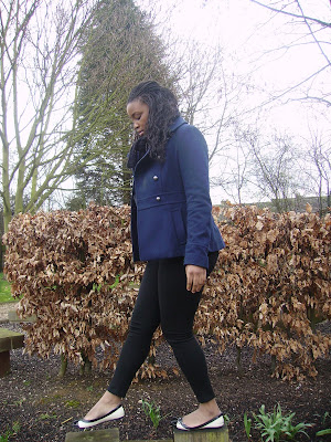


We decided to put our main character in a blue coat to carry on the theme of blue as this colour signifies sadness. in all of these shots she is alone to denote the loneliness in her new life and how she is finding it difficult to fint in, this therefore helps the audience to relate to her. We chose the mise-en-scene that we had a wide choice of photos to choose from in the selection process, for example in the last picture we have carefully placed our main character in a setting with dead trees and bushes to signify how she has lost everything in her life and it emphasises her sadness.
In the selection process we decided to choose the top picture as we felt that it captured the sadness in her face and posture. As well as this we felt that the fact that it was a mid-shot was conventional of a film poster and magazine front cover, which we realised, in previous research of promotional campaigns of films of our genre. We also felt that it enabled the viewer to get a clear look at the characters emotion as well as her posture and lonely surroundings. After deciding on this picture we are going to edit the photos enhance the colour and keep up the significant themes.
Love the blue, it reflects on the mood and has great visual impact. Some terrific evocative pics here team.
ReplyDelete