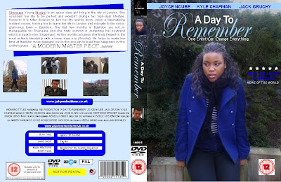
Firstly, to maintain consistency we used the image that we have used throughout all of our ancillary tasks, therefore they can all be linked. We also continued to use the same colour scheme and text to make all of our ancillary tasks cohesive. This therefore makes our film easy to recognise. As well as this we have also kept up the consistency by using the same website address, synopsis, production logo, credits and the same font for the title as in our teaser trailer and ancillary tasks to maintain cohesiveness. Included on the back of our DVD cover are pictures that are images from our film. We felt that this was relative and gave the viewer indications about the film.
In our previous research of DVD covers we discovered many conventions; here are the conventions that we included: synopsis, pictures, production company website, credits, running time, language, main feature subtitles, company logo, classification, barcode, reviews from magazines, layout, main cast, titles, strap line and a big picture as the background image. We decided to use all of these conventions on our own DVD cover to make it look as professional and realistic as possible.
In our previous research of DVD covers we discovered many conventions; here are the conventions that we included: synopsis, pictures, production company website, credits, running time, language, main feature subtitles, company logo, classification, barcode, reviews from magazines, layout, main cast, titles, strap line and a big picture as the background image. We decided to use all of these conventions on our own DVD cover to make it look as professional and realistic as possible.
Good work girls, good use of conventions and effective consistency to create cohesion across your promotional campaign.
ReplyDelete