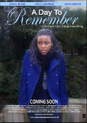
 Firstly, we chose this image for our poster as we felt that it was effective in catching people’s attention, as it was successful in portraying the characters emotions. The theme of blue, such as the blue coat the character is wearing is also effecting in showing the sadness of the character. The use of mid shot is effective as it enables the viewers to get a clear look at the character, as well as the surroundings. It enables them to see the emotion of the character and relate to her. It is also conventional to most other film posters which we found in our earlier research, the film posters commonly include mid shots or long shots.
We maintained the theme of blue throughout, such as in the film titles and character names to make it cohesive and set a theme. We kept the same font ,font colours and positioning of the text as the DVD cover to make it cohesive and recognisable to the public.
From our research on existing film posters, we took in to account the conventions needed for a film poster. We found that in most cases these varied for example some film posters included more information than others such as the film website address. The conventions that we included were: ‘Coming Soon’, the production company logo, the film website address, the cast names and other credits. We also tried to order them in the most conventional way.
The use of mid shot is effective as it enables the viewers to get a clear look at the character, as well as the surroundings. It enables them to see the emotion of the character and relate to her. It is also conventional to most other film posters.
Again, a real sense of cohesion across the artefacts; the blue is very effective in drawing attention and the Coming Soon helps meet teaser poster conventions.
ReplyDelete