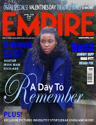
 Firstly, we used the same image that we have used through out our ancillary tasks as this would enable the image to be recognisable to the public and they would be able to link it to the film. It has maintained cohesive along with the colour scheme of dark blue, light blue and white, which we also used as the colour scheme for our magazine. This was ideal as when researching existing 'Empire' magazine front covers, we noticed that normally the colour schoeme featured on average three different colours, so therefore we also did this. We also used the same text in our magazine front cover as the rest of our ancillary tasks to again keep it cohesive and recognisable text.
We included the conventional featured of an 'Empire' magazine front cover, such as we noticed that every empire magazine cover featured the date and prices above the letter 'M'. We also used the strap line on the left hand side under the title and on the right hand side put the magazine website address. Our image that we used over lapped part of the title and this commonly occurs in existing 'Empire' magazine front covers as it suggests that the magazine is well branded. Having the character in front also makes the image stand out. We included a bar code on our magazine front cover and put it on side ways as in most editions of 'Empire' magazines this is done.
The cover line on our magazine was the title of our film as this is the main article featured in the magazine. We had it central and the biggest piece of text on the cover to inform the audience that it is the main feature in the magazine and to make it stand out. We used teasers to attract the audience and make them excited about the content of the magazine therefore making them want to purchase, for example 'Exclusive Interviews' and 'Plus More'.
Good work, it makes sense to create an image that will be repeated throughout. You effectively recreate the necessary conventions of an Empire cover.
ReplyDelete